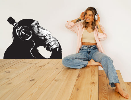
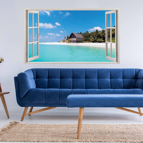
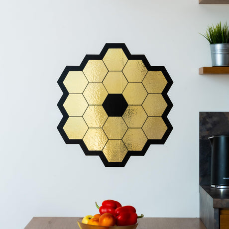
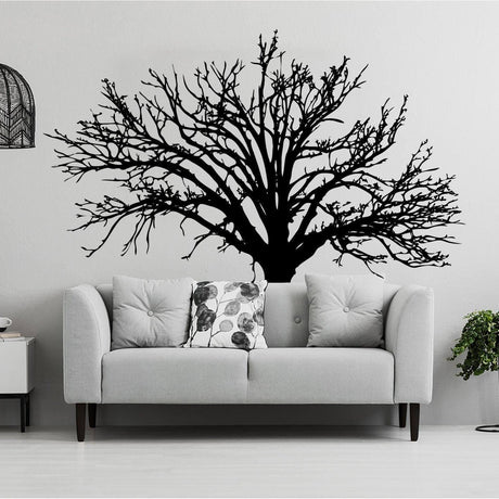
This guide focuses on the visual composition of wall art: scale, focal points, furniture relationships, gallery spacing, colour and negative space. It covers prints, photographs, canvas, decals and murals used primarily as artwork. For shelves, mirrors, signs, panels, storage and other functional formats, use the broader wall decor comparison guide.
Start with the viewing position
Identify where the composition will normally be seen: from a sofa, bed, dining table, desk, entrance or corridor. The wall may be large, but the useful art area is defined by furniture, doors, lighting and the viewer’s distance.
Choose the visual hierarchy
| Hierarchy | How it works |
|---|---|
| Single focal piece | One print, canvas, decal or mural carries most of the visual attention |
| Primary piece with support | One dominant work is balanced by smaller related pieces |
| Gallery group | Several works are organised by a consistent boundary, centreline or spacing system |
| Repeated series | Matching sizes or subjects create rhythm across a long wall |
| Quiet accent | A smaller work supports the room without competing with furniture or architecture |
Do not give every wall and every artwork equal visual weight. One clear hierarchy is easier to understand than several unrelated focal points.
Match art to furniture scale
- Measure the furniture group below the proposed art.
- Measure the clear wall width and height above it.
- Mark the proposed outer boundary with removable tape or paper templates.
- Check the composition from the normal viewing position.
- Adjust for lamps, shelves, curtains, switches and door movement.
Artwork above a sofa, bed or sideboard should feel connected to the furniture group rather than floating independently on the complete wall. A vertical composition can suit a narrow wall, while a horizontal group can relate more naturally to wide furniture.
Compare flat wall art formats
| Format | Visual strength | Planning point |
|---|---|---|
| Framed print or photograph | Clear boundary and easy grouping | Frame dimensions, reflection, mounting and spacing |
| Canvas | Physical depth without visible glazing | Edge treatment, complete dimensions and wall fixings |
| Wall decal | Artwork appears integrated with the wall | Surface compatibility, finished size and removal |
| Wall mural | Large connected image and immersive scale | Crop, panel joins, wall measurements and viewing distance |
| Unframed paper or textile print | Lightweight and flexible presentation | Flatness, mounting method, cleaning and edge protection |
Create a gallery layout before drilling
Arrange pieces on the floor or create full-size paper templates. Choose one organising principle:
- a shared horizontal centreline;
- a common top or bottom edge;
- a rectangular outer boundary;
- consistent gaps between pieces;
- a central anchor with smaller works around it.
Check the complete group as one composition. Random small variations in spacing are often more noticeable than differences in frame style.
Use negative space deliberately
Open wall area is part of the design. Leave enough space around a focal work for its outline to remain clear. A gallery group also needs a visible boundary from nearby shelves, lights, doors and other decorative zones.
Plan colour and contrast
Repeat a limited number of colours from furniture, rugs or textiles. High contrast gives artwork more visual authority. Lower contrast creates a quieter background. Transparent decals, light prints and pale imagery can interact with the wall colour, while glossy frames can reflect windows and lamps.
Review samples or proofs in both daylight and evening lighting. Screen colours are approximate and should not be treated as an exact physical match.
Coordinate several art formats
Framed prints can be combined with a decal or mural when one element remains dominant and spacing is controlled. Avoid placing a detailed decal, gallery wall and strong mural in the same small visual zone. Use repetition of colour, line or subject to connect different formats.
Ideas by room
Living room
Relate the main composition to the sofa, media unit or dining zone and check it from the principal seated position.
Bedroom
Use controlled contrast and keep the composition clear of lamps, headboards and curtains. A calm result depends on scale as much as colour.
Workspace
Choose one concise visual focus and avoid dense detail directly behind a screen or in a zone requiring concentration.
Children’s room
Use original age-appropriate artwork and keep small elements, cords and mounting parts out of reach. Allow for furniture and interests to change.
Kitchen or dining area
Choose a location away from direct heat, grease and repeated splashes unless the exact material supports that exposure.
Use original or authorised artwork
Use personal photographs, original art, company-owned assets or properly licensed work. Check reproduction rights, final-size resolution, crop and any font licences before printing. Do not copy recognisable characters, logos, photographs or artist work without permission.
Plan mounting and care without changing the visual role
Verify that wall fixings suit the wall construction and total weight. Adhesive art needs a compatible, stable and fully cured surface. Paper, canvas, vinyl, glazing and textiles require different cleaning methods. Keep product records so the arrangement can be moved or removed correctly.
Frequently asked questions
Does every wall need artwork?
No. Open walls can improve visual balance and make the main composition more effective.
How high should wall art be placed?
Use the normal viewing position, furniture relationship and full composition rather than one universal height.
Can different frame styles be mixed?
Yes, when spacing, colour or another organising principle keeps the group coherent.
Can a mural and framed prints share one wall?
They can, but one should remain dominant and the combined zone needs enough negative space to avoid visual competition.
Can wall decals be reused?
Only when the exact product states that it is designed for removal and reapplication.